Brief Two - Device Usability Report

Canon Powershot A70 Digital Camera
I have chosen to analyze my digital camera for this module as I have very few gadgets to choose from and it’s a nightmare to use. In this report I hope to describe the myriad ways this device frustrates and confuses me as I think the designers must have skipped their Usability lectures at university. It’s interesting that it does actually serve its function and I am reasonably satisfied with the photos and videos it takes but in terms of my experience as a user it does very little right.
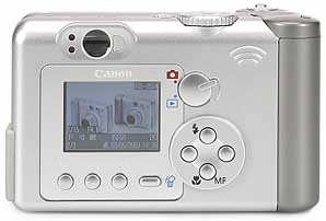
The Canon Powershot A70 is a mid priced, hand held digital camera capable of taking videos with sound and it is operated by 9 buttons, two dials and a switch. It has a digital display about the same size as that you would find on a mobile phone which you normally use to arrange your shots although it has a traditional glass lens as well. The digital screen displays all the various menu screens and is your only real means of keeping track of what image capture options you currently have selected. It has a 3 X Zoom on the lens and it records images at 3.2 Mega Pixels which places it in the lower end of the mid range for modern camera capabilities. It is definitely intended for the amateur, casual use market as the lens and image quality would make it inadequate for professional photographers. I also reckon the price and level of technical expertise necessary to operate this device would make it unattractive to children and younger teenagers. It comes with software which allows you to transfer files from the camera to your PC via a USB cable. If you didn’t have a computer it would be possible to take the memory card out and get your images processed at a printers. The device isn’t waterproof and wouldn’t be robust enough to withstand being dropped on a hard surface but is otherwise suitable for sensible outdoor and indoor use. Its size and weight would prevent you carrying it in your pocket and it’s more likely you’d transport it in a bumbag or rucksack. I imagine the average owner of this camera would use it for recording family functions, acquiring images to use on their computers or taking shots of a tourist attraction while on holiday.
First impressions of the camera are quite good; it looks attractive and expensive with its shiny silver finish and rounded edges. The only slight concern at this stage would be the sheer number of controls which all look unclear as to their usage. Upon picking it up you realize it is actually a bit heavier then it looks like it might be and there is no way to comfortable hold it without placing the fingers of your left hand right across the lens. The silver finish which made the device look so hi-tech isn’t actually very pleasant to touch, I find it prone to feeling cold and a bit slippery in the fingers and it seems to encourage the vague fear that it will slide right through my fingers onto the ground every time I pick it up. The positioning of the controls suggests that you would hold the camera in both hands with the lens pointing away from yourself while you interact with it. The shape of the device doesn’t really make this a very pleasant method of control however with some of the actions requiring fiddly readjustments of the camera’s weight in your grip. There is a large lump on the right hand side of the device which makes your gripping method strangely uneven and I get an ache in my right wrist if I’ve been using the camera heavily from the awkward and unnatural position it forces my hand into.
One simple action illustrates how poorly designed this camera is for its purpose, and that is switching the device on. The kind of casual use that this camera is supposedly designed for will often see a user carrying the device in their bag, switched off to save battery power, when they notice something that takes their eye and feel like capturing, say a squirrel running out onto the path in front of them. After grabbing the camera from their bag they will next wish to turn it on. With the device in your usual two handed grip the back of the camera is facing you and you know from previous experience that the on button is on the top so you have to go through a very fiddly readjustment of your fingers to get in a position to press the button. Now, from the position you are holding the camera; so you can see where the little on/off button is and be sure you are actually pressing it because it is flush with the surface surrounding it you can’t see the digital display screen to know whether you have successfully managed to turn it on or not. You find yourself turning the camera upwards and downwards, making sure you are keeping pressure on the button while checking to see if the screen has come on yet. The camera can be switched off with the same button with one press but it needs to be held down for about 4 seconds to power up, something which might easily slip your mind and see you unsuccessfully attempting a quick press, wasting more time. Finally there is a bleep, the screen switches on and you have to conduct another nimble readjustment to get your fingers out of the way of the lens and display and your right index finger on the ‘take picture’ button which is also so smooth and undefined by colour or shape that it takes another glance to check you have actually got your finger in a position where you will be able to press it. By this time the squirrel is probably gone. This example assumes prior knowledge of where the on/off button is, a user who was new to the camera would find the operation even more difficult as the button is made to look so discreet and placed in such an unexpected spot (dead centre on the top of the camera) that you can’t use either your idea of how an on/off switch should look or any experience you might have with similar sized electronic devices in terms of the positioning.
Much of my interaction with the camera follows in a similar vein with the positioning of the controls and the organisation of the menu screens seeming unnecessarily awkward and convoluted. On an interesting point, I have lost the manual for this camera and now I have no idea what the majority of the options available to me actually do and I keep away from a good deal of it’s functionality because I have long since forgotten what it does. I also have a Nokia camera phone for which I don’t have a manual and which I find implicitly logical and largely satisfying to use. I feel one of the two main usability problems with my camera is the inconsistent and overly complicated menus, of which there are three that I know of, all in different formats, some text based, some with icons, all accessed and controlled in different ways. Imagine if a mobile phone used an equivalent system; so complicated that it defied any attempt to learn or remember how to perform tasks and in which trial and error button presses switched icons on for which there was no obvious meaning or took you into bewildering lists of very technical specifications you feel scared to change. No-one would buy it! Both devices have an equivalent number of options available to a user but one is straightforward and obviously designed for ease of use while I feel like I would need to have read the manual for this camera cover to cover several times to feel confident in its use.
The second major of usability issue I would raise is the sheer number of control methods and their poorly thought out placement on the device. It almost seems as if the designers wanted to add a button, dial or switch for nearly every major action you would perform while using the camera. There’s a dial which adjusts the basic picture type, a switch to flick the screen between a review mode to look at images you’ve already captured and a display of the current view through the lens, a button to turn the flash on or off, a button to switch the digital display on or off and so on. All this succeeds in doing is forcing a user to remember every buttons purpose or squint at the low contrast text to read what it does. Important buttons are also barely distinguishable from practically useless ones. The ‘display on/off’ button is prominently placed in the row of four buttons beneath the display itself, a prime position for finger pressing and yet, I have never wanted to turn the display off once in years of owning the camera, it’s simply too key a function. Similarly illogical is the arrangement of the main menu which gives equal importance to very useful functions like ‘Auto Power Down’ and fripperies like shutter volume and startup image. Add to that the fact that the usage of your controls will change in different menu screens, some being vital while in one menu and completely disabled in another and you end up with a very poor user experience. This device needs a ‘back to basics’ look at how the actual users will actually use it and I think I will take a good look at how the control methods and menu organisation methods so successful in mobile phones could be used to improve this device.
posted by nick_gerrard @ 8:57 AM
![]()

0 Comments:
Post a Comment
<< Home