Canon Powershot A70 - Redesign document

My Approach
Although in my opinion this camera needs a complete redesign from the ground up I knew that I wouldn’t have enough time to look at every aspect of the device. I decided to focus on the ergonomics of the device, particularly the various input methods, as tackling the menu system would require a serious consideration of how a user would physically interact with it anyway. It struck me from an early stage that a mobile phone style interface would not only be very accessible to new users of the camera but feel instantly familiar and unthreatening given the widespread proliferation of phones. I wanted to do away with as much of the currently very confusing A70 interface as I could but I found that this kind of device does demand more different control inputs then I would’ve liked. I could’ve made an interface as paired down as that on an i-Pod but I would’ve forced the user to navigate so many steps to access certain functions that my redesign would’ve been slower to operate then the current model. From this frustrating starting point my paramount concern became making the device feel more natural to hold and operate. I kept referring back to the real device while sketching, gripping it and imagining where on the camera I could comfortably reach with my thumbs. I found this a fairly straightforward exercise, listing problems I’d raised in the previous module and thinking of logical solutions. However, with this being my first ever product design I had never encountered the extra dimension of creating something as pleasing in the hands as it is to the mind of the user. I believe my approach was sound and well informed by what I have learned from recent lectures but extensive user testing would be necessary to not only make the menus more logical but tie them to my new interface arrangement as efficiently as possible.
Environment
I began with considering the environment this camera would actually be used in. This device would be used both indoors and out, in a variety of environmental conditions, bar heavy rain. I put a rubber grip covered with gently embossed oval shapes around the sides of the camera so that even if your hands were wet or it was a cold day you would have a tactile grip that feels very secure. This has the added benefit of making the camera appear more robust, more waterproof and more inviting an object to hold against your skin. I’ve added a little battery power indicator graphic to the bottom right of the screen so that when users are planning to take the camera outside and away from their charger they will know if they need to pack extra batteries or charge the camera before they leave.
Basic Changes
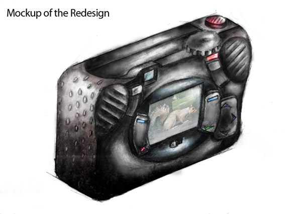
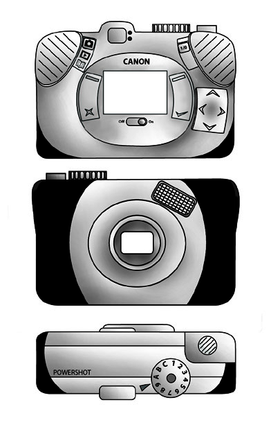
To counteract the previous models awkwardly lopsided shape, which was prone to causing stress in a user’s hand after prolonged use, I ‘flattened out’ my device and moved the display screen to the centre, making it symmetrical. My new version is now slightly longer, still accommodating 4 AA batteries but it enables a user to carry the device in their pocket, the previous drawback to doing this being more about the ‘lump’ on the camera’s right side than it’s weight or length. Instantly you have a more natural grip position too, previously you would have your left fingers across the display screen when you initially picked up the device. I have decided on a heavy black plastic for the housing, a metallic camera may look more expensive but it also weighs more and is often cold to the touch whereas I wanted my camera to feel more friendly and practical. The ridged ‘thumb pads’ encourage and neatly accommodate a natural grip, making the device feel even more secure in a users hands. I have significantly raised and added gentle ridges to the ‘Take Picture / Begin Recording’ button, because you can’t directly see the it when you are concentrating on the display it is important that your finger can easily find it and that you can position yourself ready for a shot without worrying whether you actually adequate contact with it. I thought it’d be much more straightforward for the user to have the On/Off button on the back of the camera, just under the thumb pad so as soon as they pick up the device they can see how to switch it on and do it without any need for grip readjustment. A little red light switches on when the device is powered up which reinforces the fact that you have got the device on and would help to remind a user to switch it off after use. I left the Picture Mode dial as it was as I think it was an aspect of the original camera that worked satisfactorily.
Input Method Changes and Justification
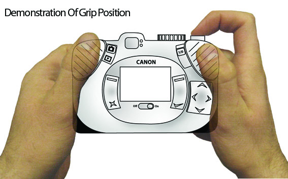
I wanted the interface on my redesign to be easily thumb operated without ever demanding a serious change in grip position. I tried to keep the lower third of the camera as free from buttons and switches as possible as this is the most awkward part of the device for the thumbs to reach and keep the most used functions in the upper third which is the easiest to access. Replacing the A70’s fiddly Playback/Capture switch and separate Menu button with one sliding switch to enable a user to move between these three modes of use is more logical as the menu screen was the third function of the display and is now grouped appropriately. A chunkier button makes switching screen modes easier for the user in ergonomics terms and grouping the three modes into one means I can lose a button from the back of the device. The display on/off is now a sliding switch, chosen to be consistent with the main on/off switch and I positioned it closely under the screen, a position familiar from use of monitors and TV sets. Without going into the playback menu too deeply the directional pad will make it significantly easier to move through selections in the playback and menu screens. A directional pad takes far less of the users concentration away from the screen then the current method with its four separate buttons for each direction. I placed a two way button either side of the display screen and these will mostly be used for making selections or going back a step in the menu/playback screens and will allow for a more accessible, mobile phone style interaction as options can be easily mapped against the four possible button pushes. The icons I have used on these buttons are a direct reference from mobile phones with two neutral blue icons at the top which are multi-use and a green and a red icon at the bottom of either button which will always signify select/advance or back/deselect. Once again it is important that the user feels comfortable with their first interactions with my remodeled camera and referencing a device they use every day seems a very effective way to do this. In Capture mode these two buttons would be used to zoom in and out.
User Testing
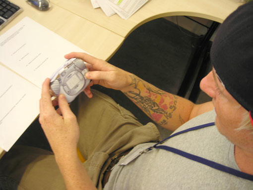
A method of user testing was somewhat tricky to conceive in relation to my device because I didn’t have the resources to redesign the on-screen functionality, so my primary concern was the ergonomics; the comfort of use and the ease with which users could control the device with their thumbs. I also wanted to know if the icons I used were clear in their meanings. I asked seven people to hold first the original camera then my cardboard 1:1 prototype and simulate performing various actions. With regards to my reorganization of the interface the feedback was overwhelmingly positive with every test subject reporting that the layout felt more natural and pleasant to use. I wanted to see if my redesign had achieved my aim of reminding users of the interface style mobile phones and by asking how familiar the interface was and 3 people responded, unprompted that it reminded them of their phones and one other describing it as similar to his PSP. People really like the directional pad as well and felt it’d be much easier to use than the current system of four buttons. So overall I feel I have achieved my basic aims very well. There were matters arising from the testing which would feed back into a further redesign however. Several of the users didn’t feel that the On / Off button was clearly enough defined with one user confusing the Display On / Off with the main On / Off switch. I think I might need to have the words On and Off on or near the main switch even though I wanted to keep the amount of text on the back down to a minimum. I think moving the flash on the front of the camera may have been a mistake as it was out of the way of my preferred grip position but proved to be under the fingers of the average user, so I might try moving it back to it’s original position. The Menu icon, which I had introduced to replace the word Menu (an open book) didn’t clearly communicate its meaning to the users with none of them correctly guessing its meaning which is a concern although after a bit of initial trial and error I think it’d be very easy to learn. I placed the user experience at the heart of my redesign and I feel like I have learned a lot about HCI from this module.
posted by nick_gerrard @ 5:57 AM
![]()

0 Comments:
Post a Comment
<< Home